
Custom component definition reference
name (required)
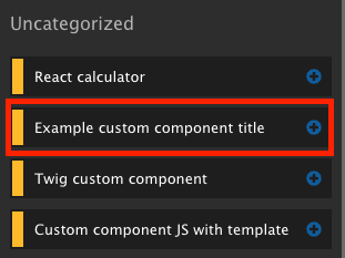
This property is used for setting the custom component name. This value is used when displaying the custom component in the Sidebar Browser, Layout Canvas and other areas of Site studio.
Expected format - string with the human readable name.
Example:
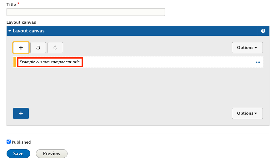
name: Example custom component title
category (required)
This property is used to define what category the custom component should be assigned to. If the specified category doesn’t exist, the component will be placed into the default “Uncategorized” category.
The list of available categories is visible in the “Component categories” list on the “/admin/cohesion/components/categories” page.
Expected format - string that contains the machine name of a category. If the available category options are unknown, the safe default option is cpt_cat_uncategorized as this will work with any set of category entities.
Example:category: cpt_cat_example
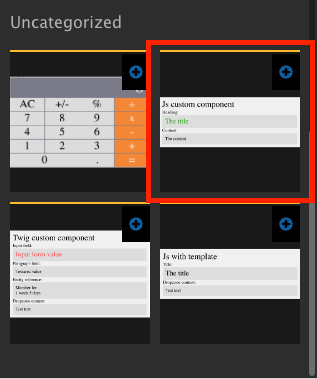
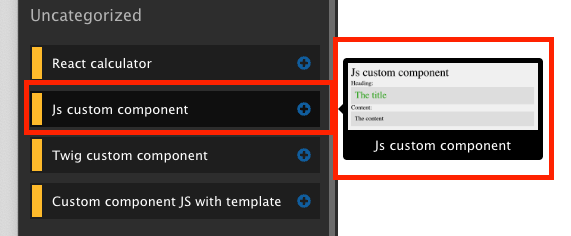
preview_image
This property is used to load a preview image in the Sidebar Browser. Expected format - string that contains the filename of the preview image, relative to the location of the definition file. Supported file formats are PNG, JPG/JPEG, BMP, GIF, WebP and SVG (tested with latest Google Chrome browser version at the time of writing, supported image formats may be affected by the browser).
Large resolution files might negatively affect editorial experience. We recommend using images up to 250kb in size.
Example:
preview_image: preview.png
availability
Custom components can be limited to be available only on specific Content Entity types and bundles of those entities. If this option is not used, the custom component will be available on all content types and bundles, where the Layout Canvas is available.
Expected format - sequence of mappings. Each mapping must contain “type” and “bundles”. The “type” mapping expects a string with entity type. The “bundle” mapping expects a sequence of entries indicated with a dash and space, where each entry is a string representing a bundle of the entity type specified in “type”.
Example:
Custom component made available on Node (node) entities of “Article” (article) and “Layout Page” (layout_page) bundles:
availability:
  -
    type: node
    bundles:
      - article
      - layout_page
template
This property specifies the path to the Twig file that will be used to render the custom component.
Expected format - string representing the file path to a .twig file relative to the location of the custom component definition file.
Example:template: template.html.twig
Cannot be used in conjunction with with html property!
html
This property specifies the path to the HTML file that will be used to render the custom component.
Expected format - string representing the file path to a .html file relative to the location of the custom component definition file.
Example:html: html-template.html
Cannot be used in conjunction with the template property
form
This optional property specifies the path to the JSON file that contains the structure required for rendering the custom component form in the Sidebar Editor. A custom form is used to define the layout of fields in the Sidebar Editor. Values entered into this form are made available to the component’s template.
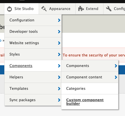
It is recommended to use the Custom Component Builder for building the form structure. Once built, you can download the JSON file required for the form. (/admin/cohesion/components/custom-component-builder)
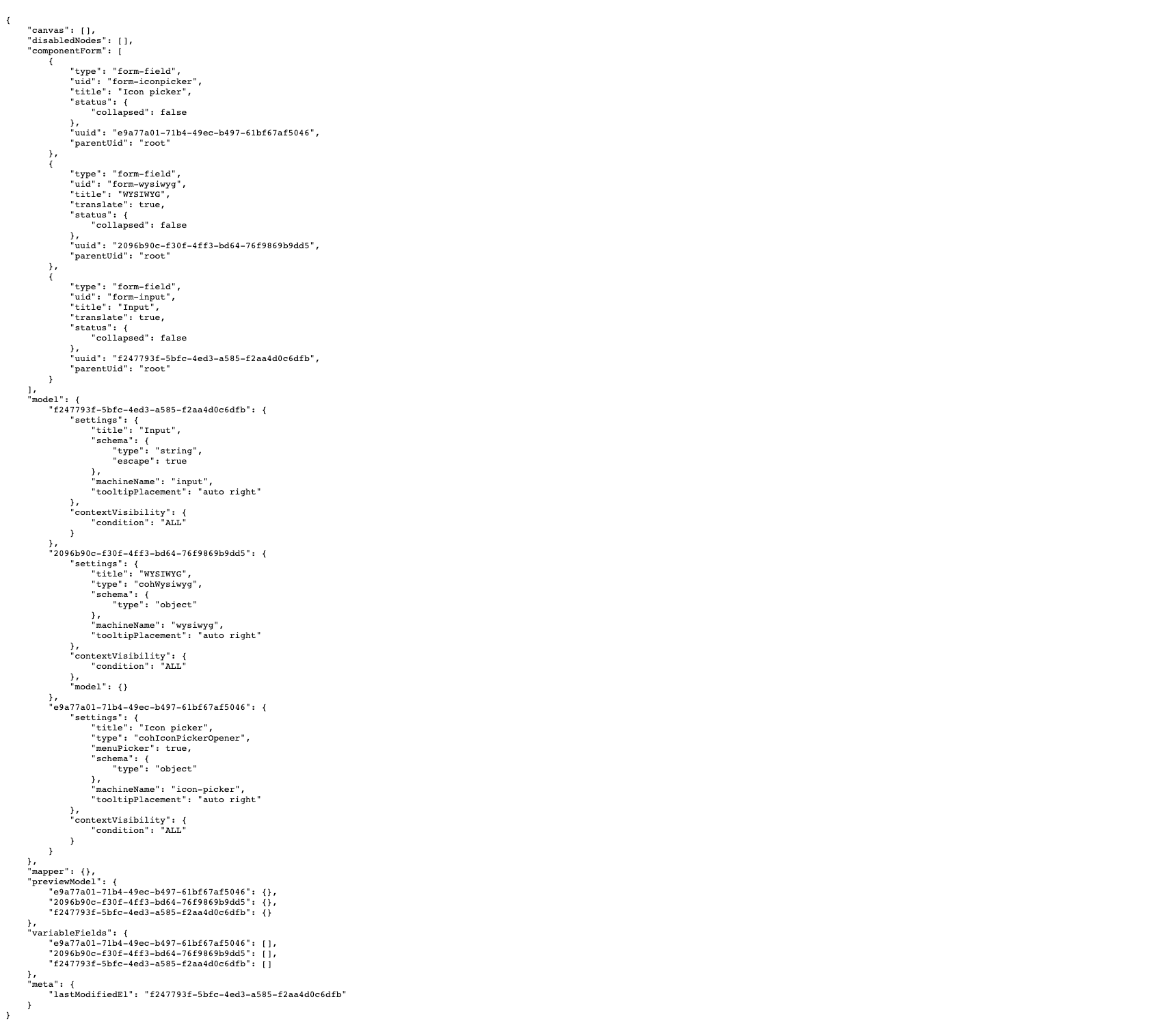
Expected format - string representing the file path to a .json file relative to the location of the custom component definition file.
Example:form: form.json
js
This property allows you to specify local or remote JS files to be attached to the page when rendering this custom component. Multiple JS files can be attached to a single custom component.
Expected format - mapping of keys and values using colon and space (key: {value}). The “key” is the path to the local file, relative to the definition file location, or full URL to the remotely hosted file. The “value” is a set of mappings in curly braces with options relevant to the file being attached. If no options are required, use empty curly braces (key: {}). Multiple files can be attached, each using a unique key.
Example:
In this example we are attaching two files - one local and one remote. The local file is “js-template.js” and is stored in the local custom component directory and uses its filename as the key without any options.
Remotely hosted “slick.min.js” file is keyed with a full URL to the file and uses options to mark it as external and minified.
js:
  js-template.js: {}
  https://cdn.jsdelivr.net/npm/slick-carousel@1.8.1/slick/slick.min.js: { type: external, minified: true, attributes: { defer: true, async: true } }
css
This property allows you to specify local or remote CSS files to be attached to the page when rendering this custom component. Multiple CSS files can be attached to a single custom component.
Expected format - mapping of keys and values using colon and space (key: {value}). The “key” is the path to the local file, relative to the definition file location, or full URL to the remotely hosted file. The “value” is a set of mappings in curly braces with options relevant to the file being attached. If no options are required, use empty curly braces (key: {}). Multiple files can be attached, each using a unique key.
Example:
In this example we are attaching two files - one local and one remote. The local file is “example_stylesheet.css” and is stored in the local custom component directory and uses its filename as the key without any options.
Remotely hosted “bootstrap.min.css” file is keyed with a full URL to the file and uses options to mark it as external, minified and with “defer” and “async” attributes.
css:
  example_stylesheet.css: {}
  https://cdn.jsdelivr.net/npm/bootstrap@5.1.3/dist/css/bootstrap.min.css: { type: external, minified: true }
dependencies
This property allows you to specify Drupal libraries that should be attached to the page when rendering this component. More information on Drupal libraries can be found <here>(https://www.drupal.org/docs/creating-custom-modules/adding-assets-css-js-to-a-drupal-module-via-librariesyml)
Expected format - sequence of individual entries indicated with a dash and space, where each entry is a string representing a library defined in Drupal.
Example:
dependencies:
  - core/jquery
  - example_module/example_library