
UIKit slider components
Slider components are used for adding sliders (carousels) to a layout. There are three Slider components included with the UIKit.
Key information about these components:
Slider container component
The slider container must be used with the Slide item component. The Slider container provides the navigation, pagination and track for the Slide items.
Layout canvas elements
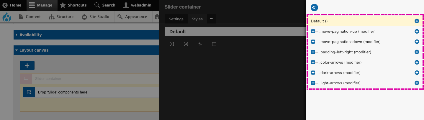
Slider container - The slider container provides the track for the Slide items. To offer flexibility for the slider's appearance and functionality, several options within the Slider container element are exposed to the component form. To view these, open the settings for the Slider container element. The options exposed include the space between the slides, the number of slides to show and the number of slides to scroll.
In addition, the component provides options for the placement of the sliders pagination dots and the style of the navigation buttons. This is achieved using classes that, when applied to the slider, modify these elements. To make changes to these 'Modifier' styles, open the Styles tab on the Slider container and then open the Style tree. Within this, you will see the different modifiers that can be applied to the Slider container.
The slider navigation relies on the custom styles Slider navigation left and Slider navigation right. The modifiers (shown below) extend these styles. You mustn't remove the two custom styles above.
Component form fields
- Show on (Desktop, Tablet, Phone) - Set the number of slides you want to show on desktop, tablet and phone width devices. The number of slides shown will determine the width of each slide.
- Scroll on (Desktop, Tablet, Phone) - Set the number of slides to scroll on desktop, tablet and phone width devices.
- Pagination position - Set the position of the pagination dots.
- Space between slides - Set whether the slides have a space between them or no space between them.
- Space left and right - Add additional space to the slides' left and right to accommodate the slider navigation arrows. This setting is recommended when the slides include text content where the navigation arrows may obscure the content.
- Add space below - Add a space (margin) below the slider. This is required if a space is desirable when adding this component above another component within the same parent layout component.
Slide item component
The Slide item must be placed within the Slider container component when used.
Layout canvas elements
Slide item - The slide item provides the container for the content of each slide. The Slide item will likely be used to contain Card components. To ensure the Cards all display with an equal height, the Slide item uses display:flex and flex-direction:column. This makes the Slide item behave in the same way as the Column layout components.
If you open the Styles tab of the Slide item, you will notice that the display:flex property has been added to the Custom CSS field. This is so that !important can be applied to the property to override the display:block property included with Slider plugin CSS.
Gallery slider component
The Gallery slider provides a slider of images with image thumbnails as navigation.
Layout canvas elements
The Gallery slider includes two Sliders. The Main slider, used for the main image and the Thumbnail slider, used for the thumbnail navigation. The two Sliders are linked together using the Use as navigation feature available within the Slider container. This works by linking each Slider together with IDs. Both Slider containers are set as the navigation for the other. This allows the two sliders to sync with each other when used. To understand more:
- Open the settings for the Main slider container and scroll to the section Use as navigation. Within this, you will see that the Slider ID is populated using a component form token. You will also see that the token has a prefix #thumbnail-[field.slider-id].
- Now open the Markup tab of the Main slider container. Within this you will see that the ID field is populated using a component form token. You will also see that the token has a prefix main-[field.slider-id].
- If you open the settings of the Thumbnail slider container, you will see the same use of tokens, except they are reversed.
- The prefix added before the tokens allow a single component field to provide all the ID's required.
Within each Slider container, there's a Pattern repeater and nested within this a Slide item and finally an Image element. The Pattern repeater is used to allow multiple Slides to be added using the Field repeater element within the component form.
The image element within both the Main slider and the Thumbnail slider is populated using the image field in the component form. This is so content authors only need to upload one image and it will be used for both the main image and the thumbnail image.
Component form fields
- Slider ID - The user must provide the gallery with an ID that is unique to the page. The ID should only include letters, numbers and hyphens. For example, slider-1. The ID cannot include spaces.
- Image - Upload or select an image.
- Alt tag - Alternative text for the image.
- Add image - Used to add another image slide to the slider.
- Gallery image size - Drupal image style to select the size of the images the gallery should use.
- Thumbnails to show on (Desktop, Tablet, Phone) - Sets the number of thumbnails to show on desktop, tablet and phone width devices.
- Pagination position - Sets the position of the pagination dots.
- Add space below - Add a space (margin) below the slider when placed above another component.