
Creating layouts with layout components
Use the Layout components to create the structure of your page. The following sections provide visual illustrations of the different layout components and the options within them.
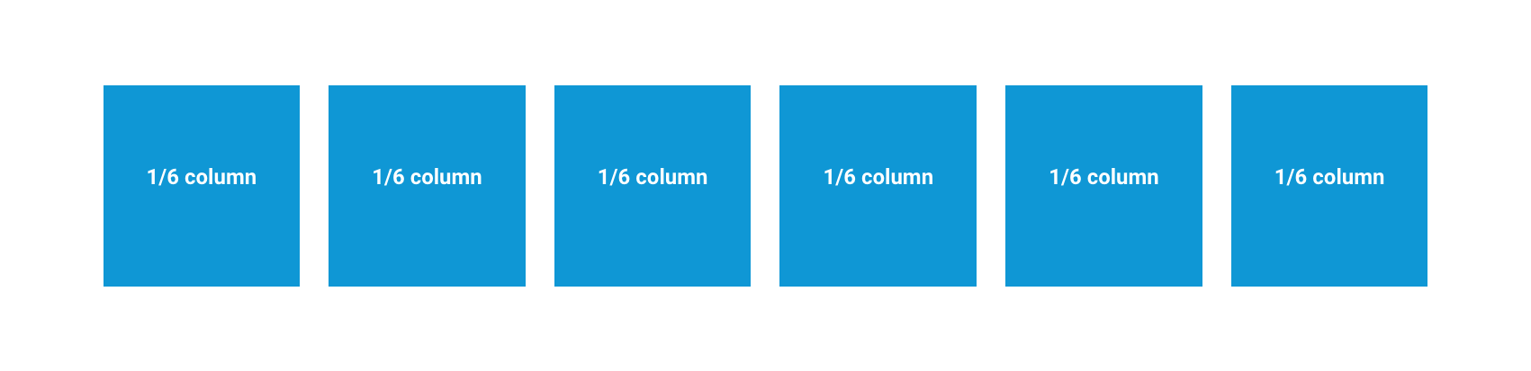
Creating layouts using the 1-4 column layout components.
Use the 1 - 4 column layout components to add columns to your layouts. They can be used as section containers or nested within each other to create a variety of layout configurations.
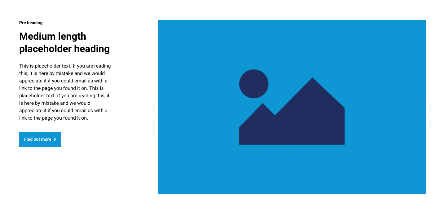
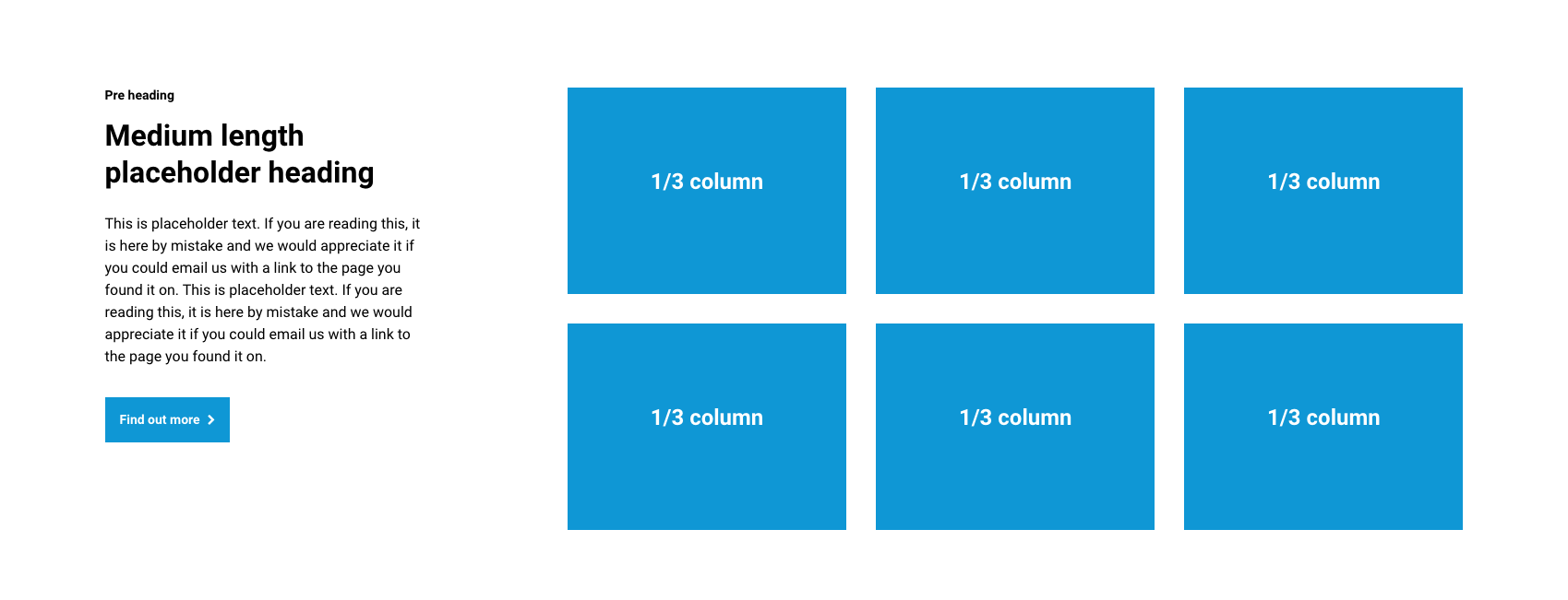
Example layout 1
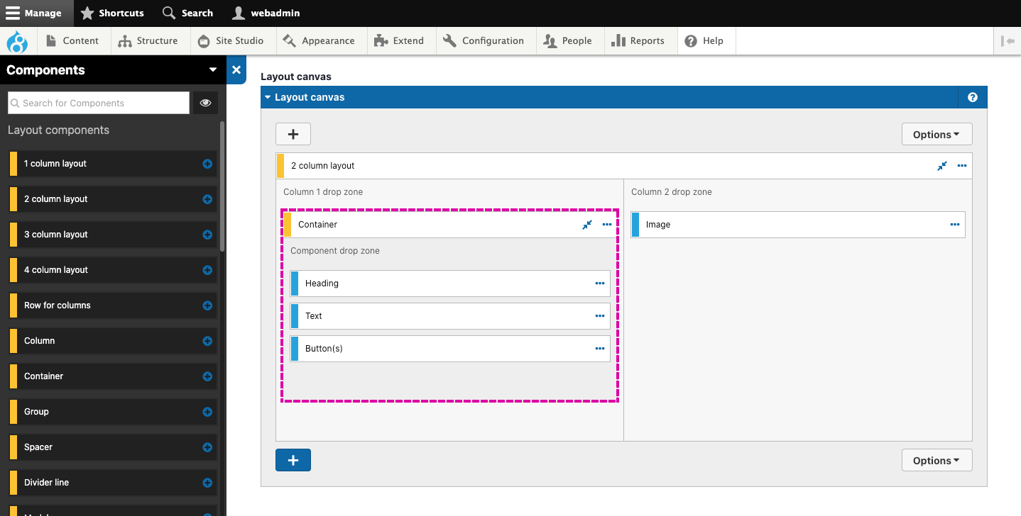
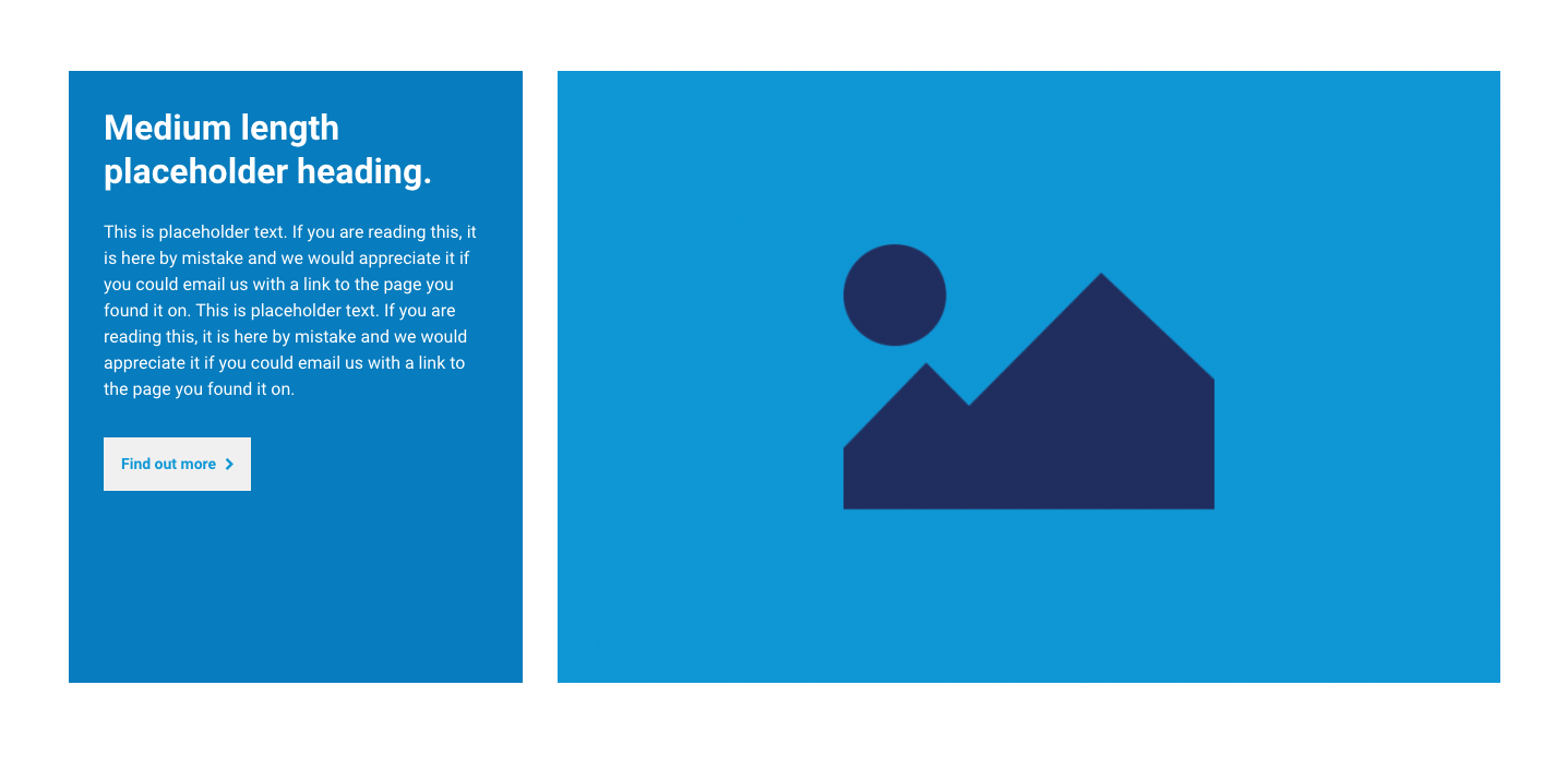
The example below shows a 2 column layout component used to create a 2 column section and how that displays on the website.
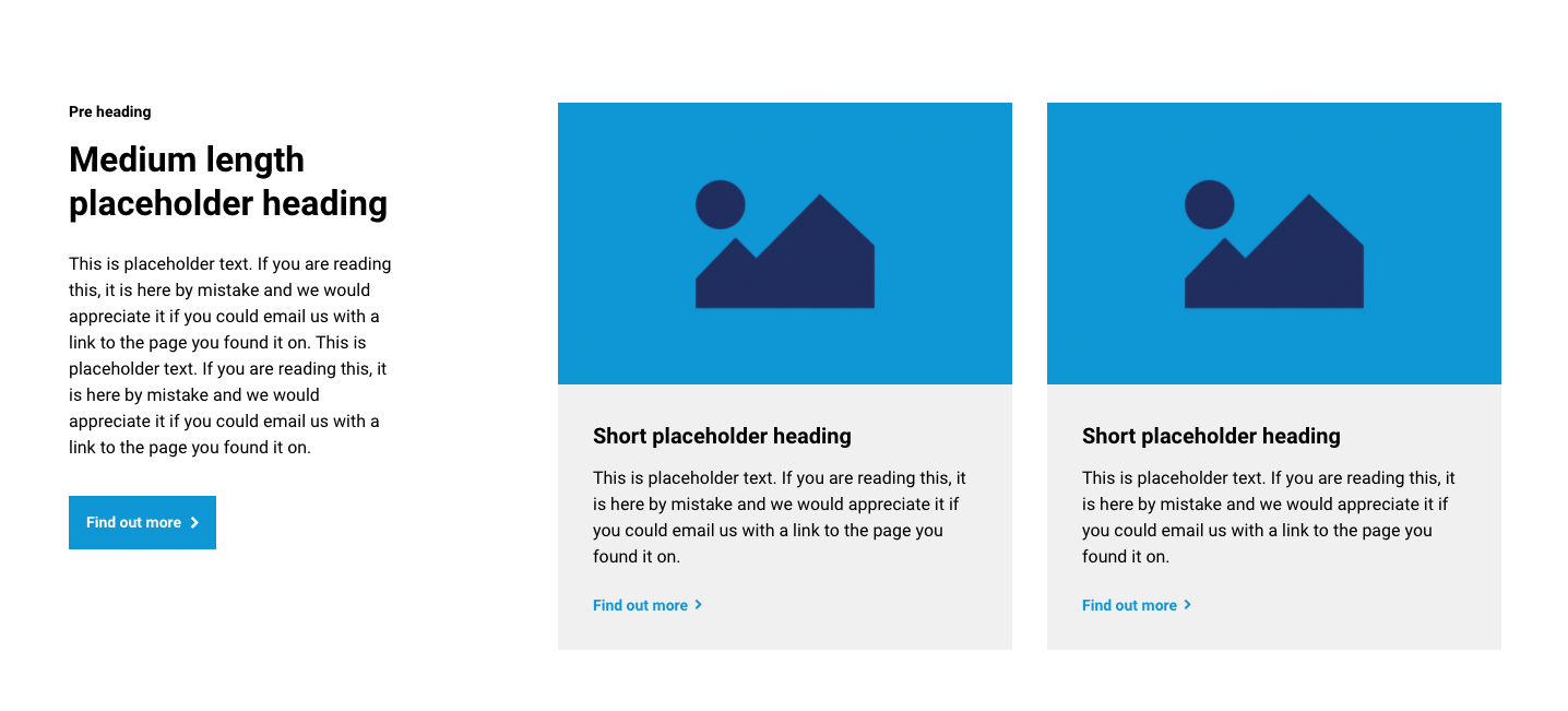
Example layout 2
The example below shows a 2 column layout nested within the second column of a 2 column layout and how it displays on the website.
When nesting a layout within another layout, you will usually need to set the Padding top and bottom field in the nested layout to None. Otherwise, you will have space at the top and bottom of the nested layout.

1 - 4 column layout component options
The 1 - 4 column layout components include several configurable options that allow you to control how the layout behaves. These are described below with accompanying illustrations.
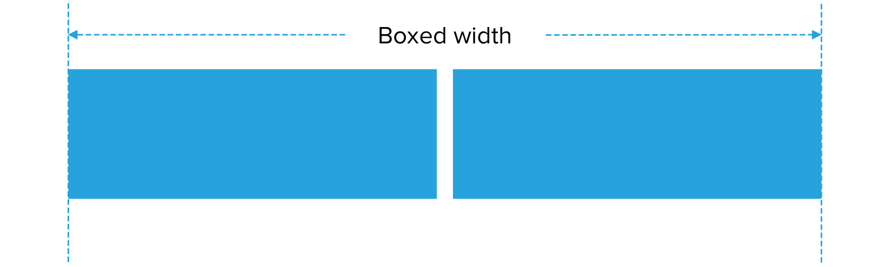
Width of content area
Width of content area allows you to set the maximum width that the column or columns can take up. By default, this is set to the width of the website grid. This is called the boxed width. You can set the field to Fluid width if you want the column(s) to fill the screen's entire width.

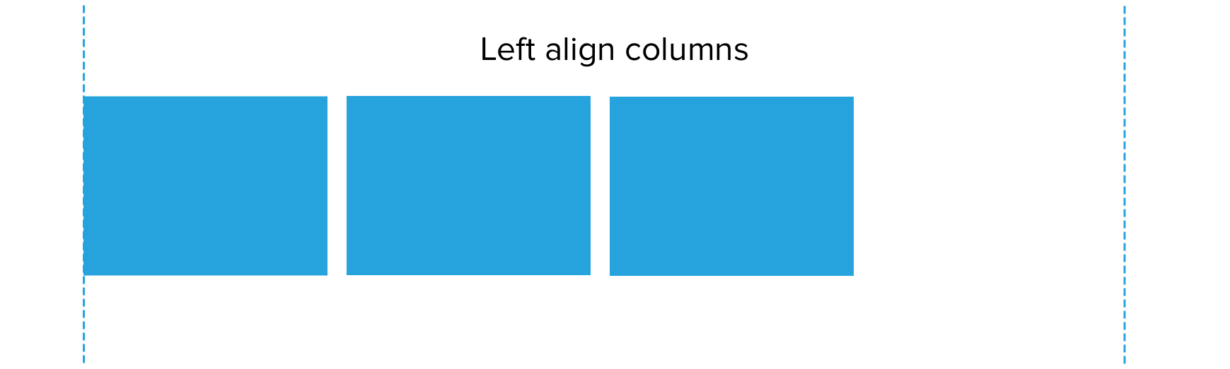
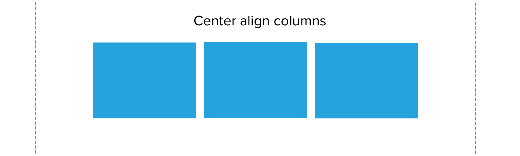
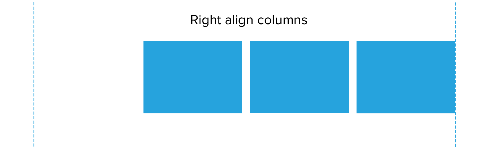
Column alignment
Column alignment allows you to position the column or columns to the left, center, or right of your layout or distribute them evenly across the available space.

Space between columns
Space between columns allows you to add or remove the gap between columns.


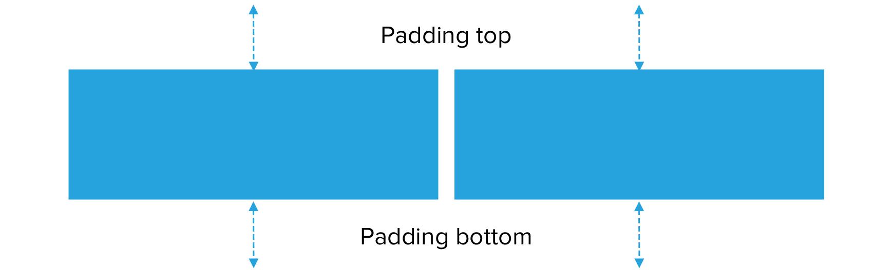
Padding top and bottom
Padding top and bottom allows you to add or remove padding to the top and bottom of the layout. By default, padding is added, but you will often need to remove this. For example, when nesting a layout component within another layout component or stacking two layout components of the same background color.
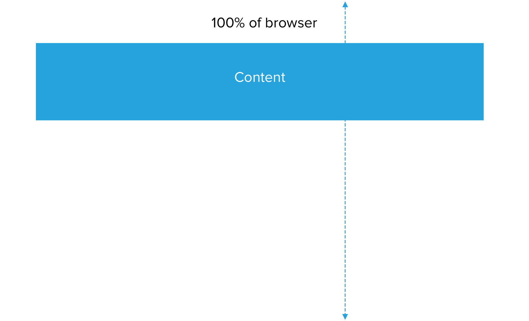
Section height
The minimum height of the layout can be set to fit the content or set as a percentage of the browser window (viewport) or a minimum pixel height.

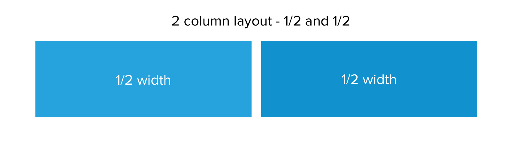
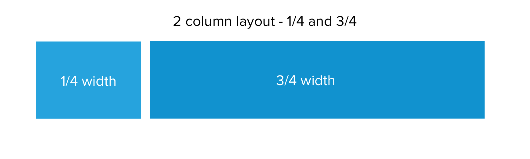
Column width
The width of the column can be set for desktop, tablet and phone width screens. This allows you to control the layout of your columns across different devices. The illustrations below show three examples of the 2 column layout component and how setting the column widths affects the layout.

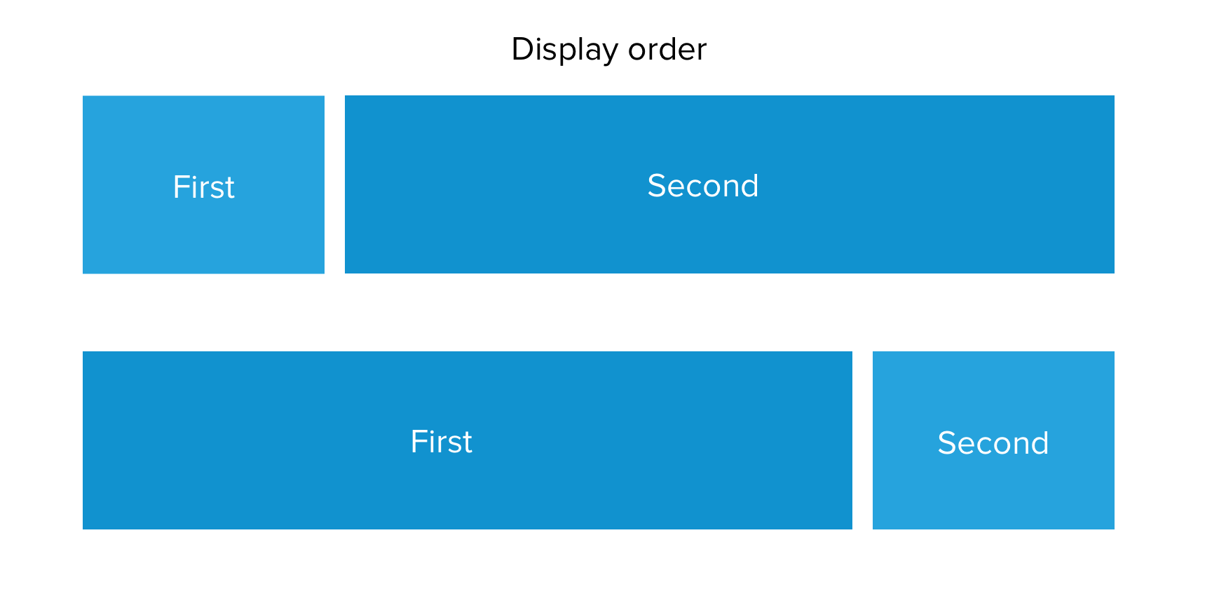
Column display order
You can change the order in which the columns display at each device's width. This is useful for altering the layout of content when it’s displayed in a row on desktop and in a column on a phone.
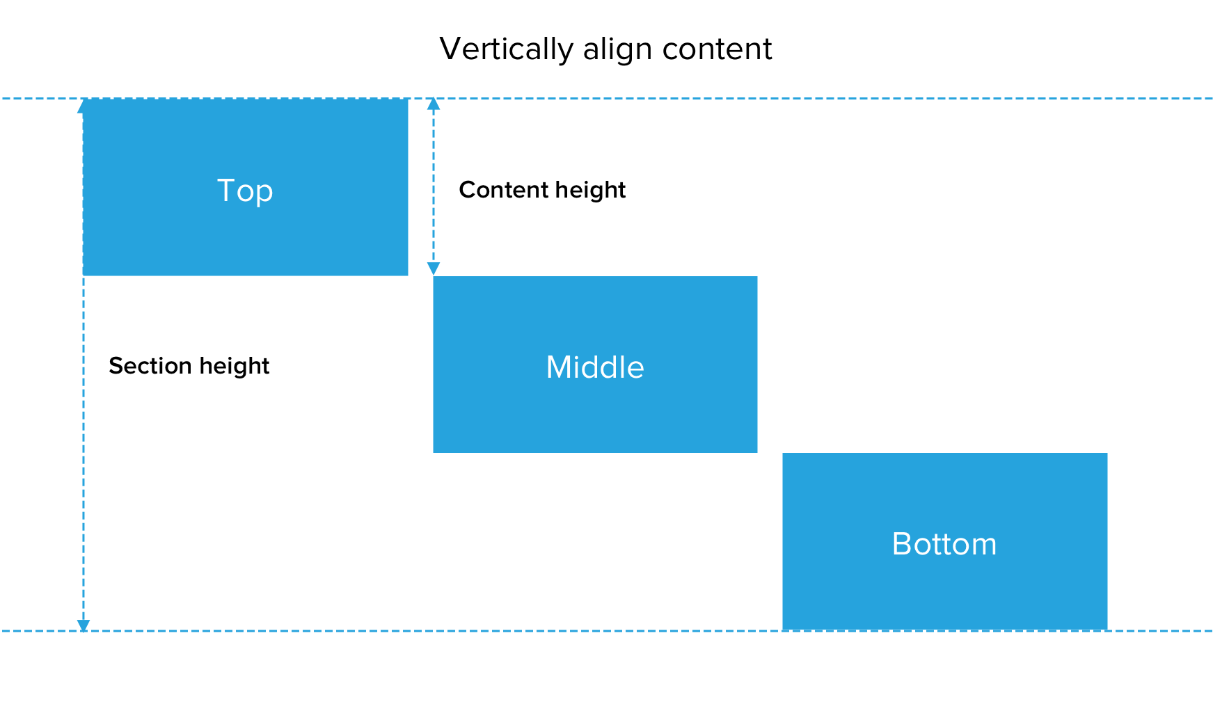
Vertically align content
If you’ve set the layout's minimum height to be taller than the content placed within the columns, you can use vertical alignment to set its position.
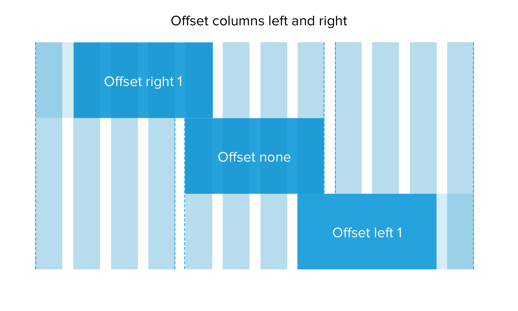
Offset columns left or right
You can move a specific column left or right using the Offset columns fields. When you offset a column, it will shift it by a specific number of columns as defined by the 12 column website grid.
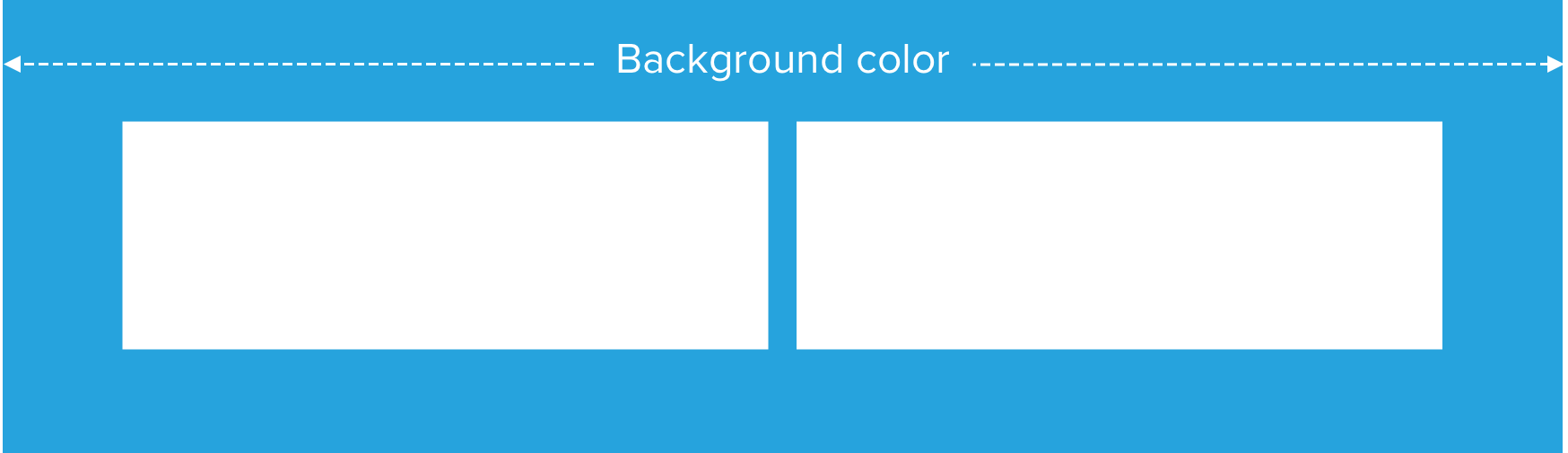
Background color
Optionally set the background color for the Layout component. The background color will fill the full width and height of the component.
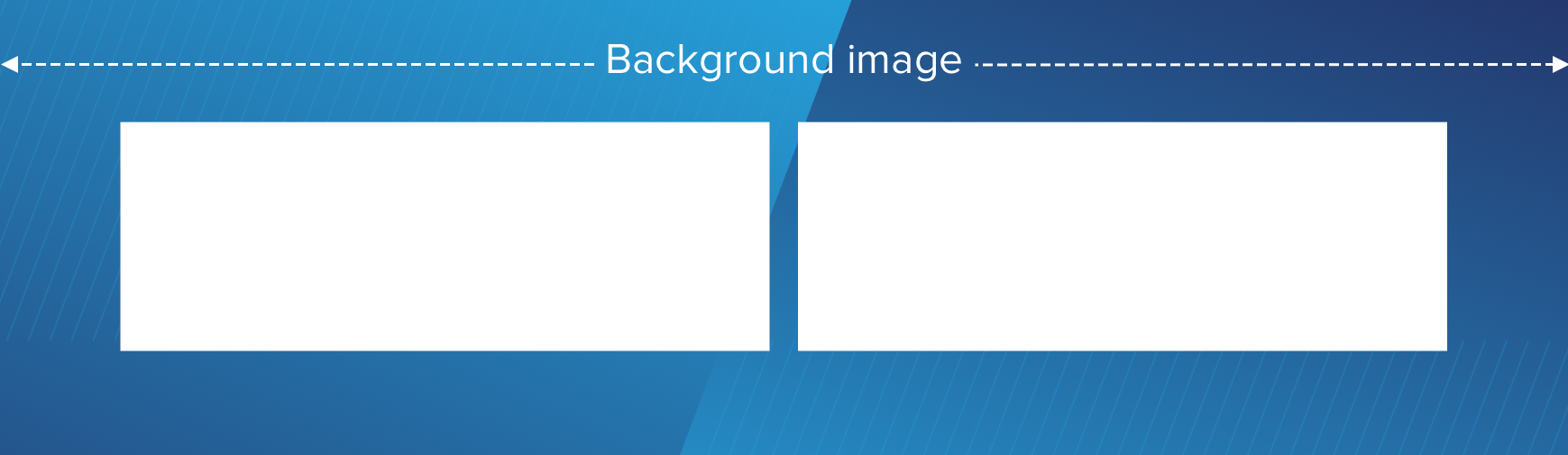
Background image
Optionally set a background image for the Layout component. The background image will cover the full width and height of the component. You can optionally set an alternative image for phones. This is useful for providing a smaller portrait format image for small screens. If no alternative phone image is supplied, the desktop image will be used.
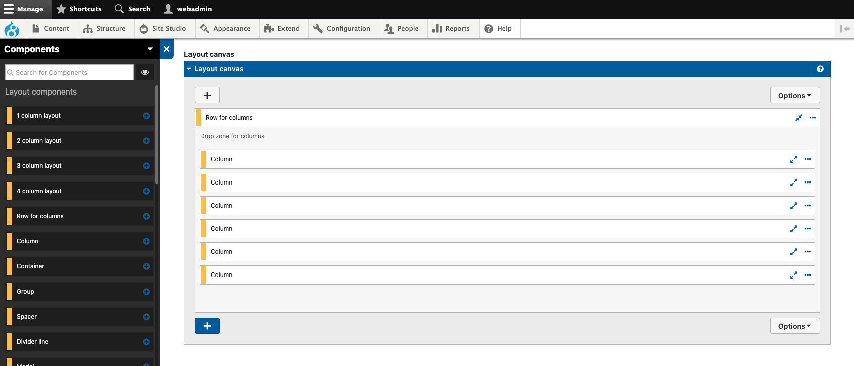
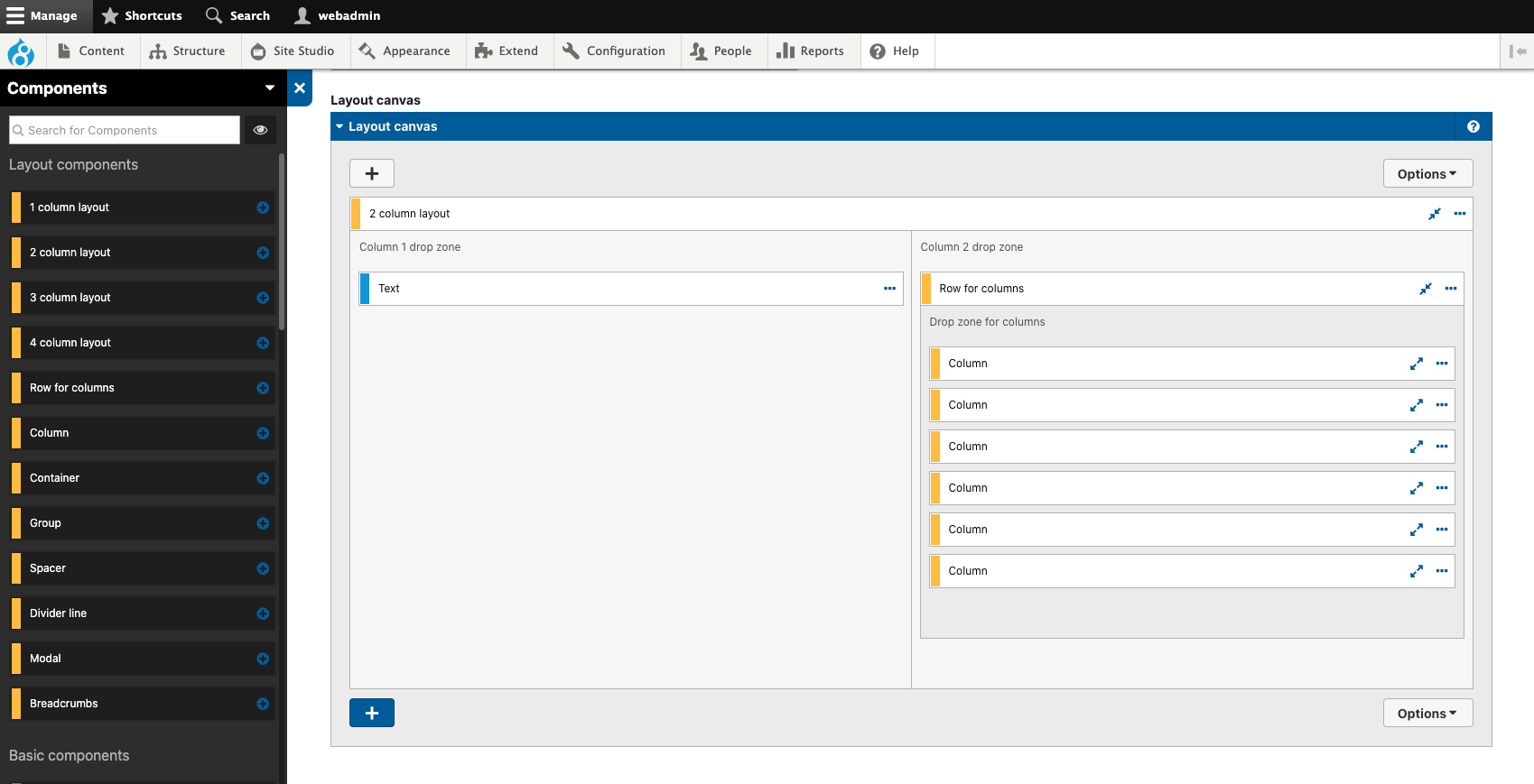
Creating layouts with more than four columns using Row for columns and Column components.
To create a layout with more than four columns, for example, a 6 column layout or a grid of columns in multiple rows, use the Row for columns and Column components.
Always add the Column component directly inside the Row for columns component.
Example layout 1
The example below shows a 6 column section using a Row for column and Columns.
Example layout 2
The example below shows a nested 6 column layout within a 2 column layout.
Using the Container component to contain multiple components.
Use the Container component to contain multiple content components within a single container. This is useful for applying a background color or image to multiple components or applying padding around multiple components. The example below shows a Container component being used to contain three content components and apply a background color and padding around the content.
Using the Spacer component to add vertical space to layouts.
Use the Spacer component to add additional vertical space above or below another component. The size of the spacer can be set independently for desktop, tablet and phone width devices.
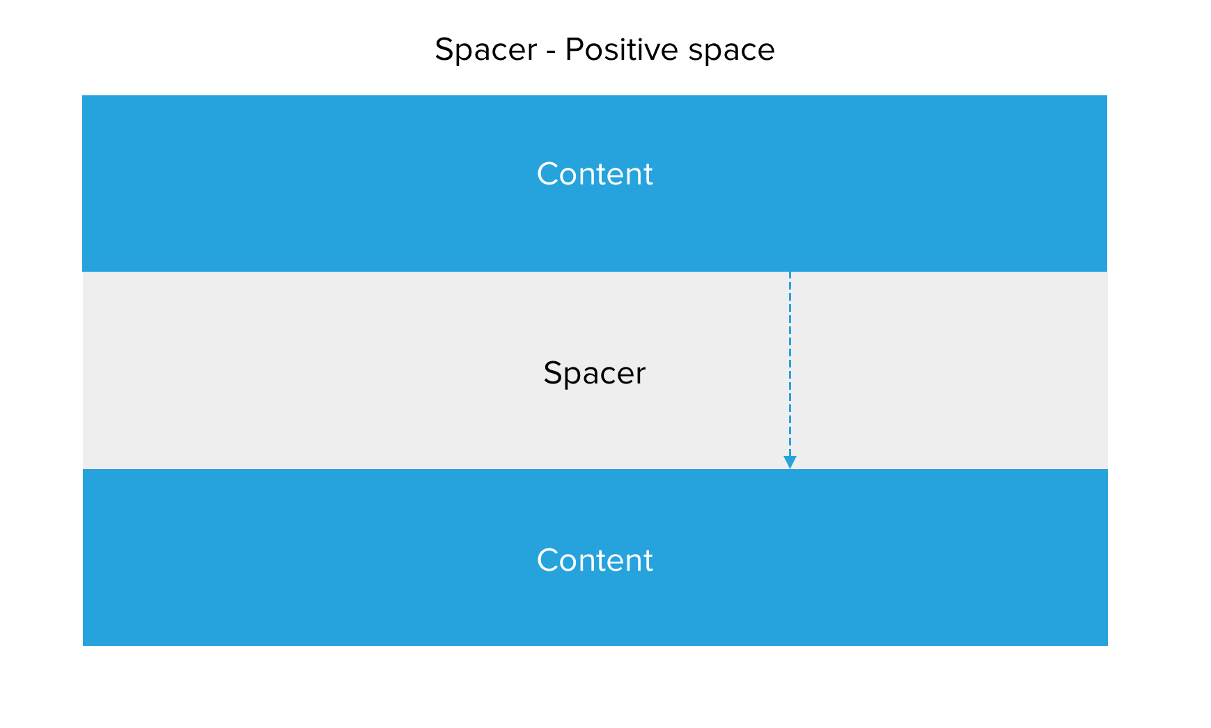
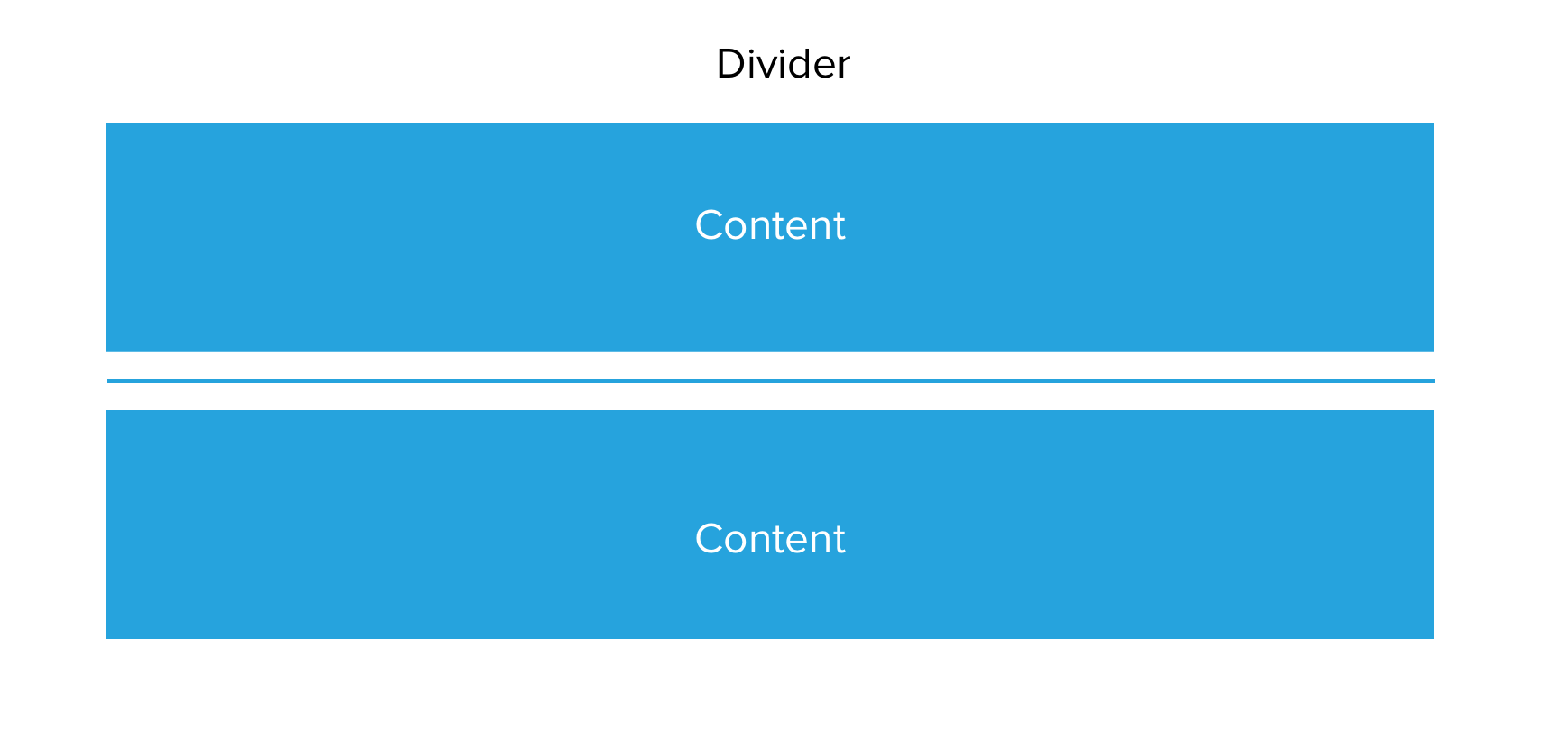
Dividing content with the Divider line.
Use the divider line to add a horizontal line between components.
Using the Modal component to add content into a modal.
Use the Modal component to add a modal pop-up to your layout. The modal component includes the button to launch the modal and the modal window container for your content. When adding a modal, two fields are required.
When adding a modal to a layout, you must give the button used to open the modal an ID that is unique to the page. The ID is required to provide focus to the button when the modal is closed. This is an accessibility requirement. The ID should be formed from letters, numbers and hyphens and not include spaces. For example, modal-one-button.
You must also give the modal window an ID that is unique to the page. The ID is required for the button to target the modal when clicked. The ID should be formed from letters, numbers and hyphens and not include spaces. For example, modal-one.