
Adding cards to layouts
Use Card components to add defined blocks of content to the layouts. The UIKit includes a selection of cards for different content and design purposes. To access the Card components, open the Sidebar and scroll to the Card components category. View the Card components available.
Placing Cards components within layouts
Card components are designed to be placed within containing components. These include the 1 - 4 column layouts, Column, Container, Slide item, Accordion item and Tab item components. When placed, they will expand to fill the available width of the containing component. This means they’re adaptable for many different layout configurations.

Equalising the height of Card components
When you place Card components in multiple columns, they will equalize in height regardless of the content within them (as shown below).
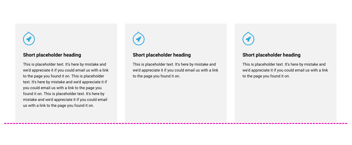 This is achieved using the Height field within the Card components. The Height settings include two options:
- Fit to content - The Card component's minimum height will be dictated by the height of the content within it. This is required if you want to align a card vertically within a column.
- Fill available space (Default) - The Card component will expand in height to fill the height of the column it's placed within. This option is needed to equalize the heights of cards across multiple columns.
Stacking Card components
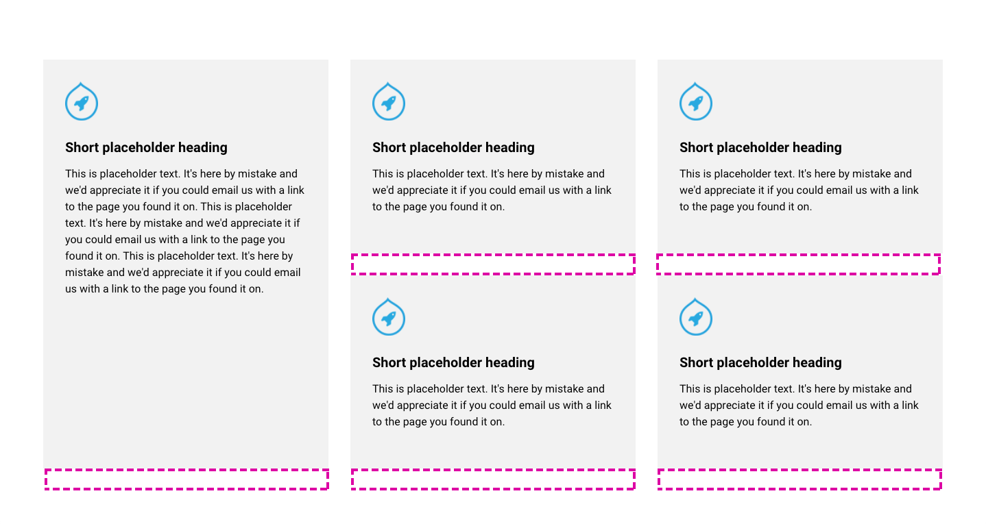
You can stack Card components on top of each other to create grid type layouts. When you stack Card components, they will fill the height available to them (as shown below) to maintain horizontal alignment. This is achieved using the Fill space available option within the Height field.

By default, there's a space below each card to maintain a separation from the card below (As shown below). This is achieved using the Add space below field within each component. The space below also acts as a separation when the cards stack into a single column on narrow screens.
Changing the color of Card components
You can change the color of the cards using the Background color field. If you select a color that has been tagged with Light, a dark text theme will be applied to the card text. If you select a color tagged with Dark, a light text theme will be applied to the card text. If you select no color or transparent color, a Text color field will be displayed so that you can manually select a Text color theme.
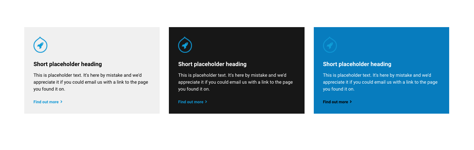
Adding a border to Card components
You can apply a border to the cards using the Border field. When a border is applied, you can select the color of the border.
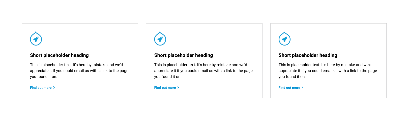
Adding padding to Card components
Padding around the text content is automatically applied if a background color or border is applied to the card. This is to prevent the text from hitting the edge of the card border. If no background color or border is applied, you can manually apply or remove the padding around the card text.